Case study Swiss ETIQ Partner: branding and website for a medical concierge service in Zurich
Client
Swiss ETIQ Partner
Industry
Medical Concierge
Location
Zurich, Switzerland
Year
2025
01 — Starting Point
An established practice, without a brand.
For years, the client had run this business: helping Russian-speaking patients find the right specialists in Switzerland, translating in appointments, arranging stays around treatments. 24 years of experience and over 600 people helped, built entirely on personal trust and word of mouth. Now she wanted a brand to match.
02 — The Problem
Designing for a person on their worst day.
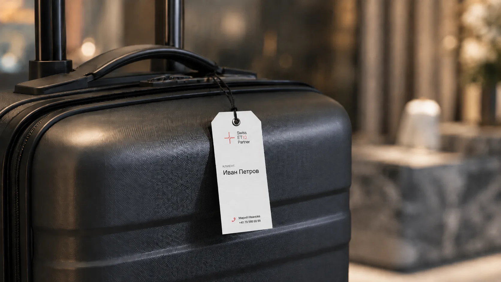
The person receiving these materials is often seriously ill, sometimes disabled, in an unfamiliar country, with no knowledge of the language or the healthcare system. Every document has to work under those conditions: correspondence in Russian, clinic and doctor names in German. At the same time, the brand has to communicate what this clientele expects: discretion and service of the highest standard. Reassuring but not clinical, premium but never decorative at the cost of clarity.
03 — Strategy
A website with a different job.
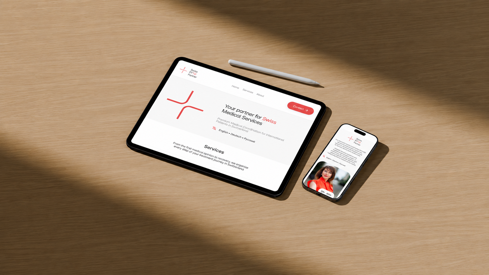
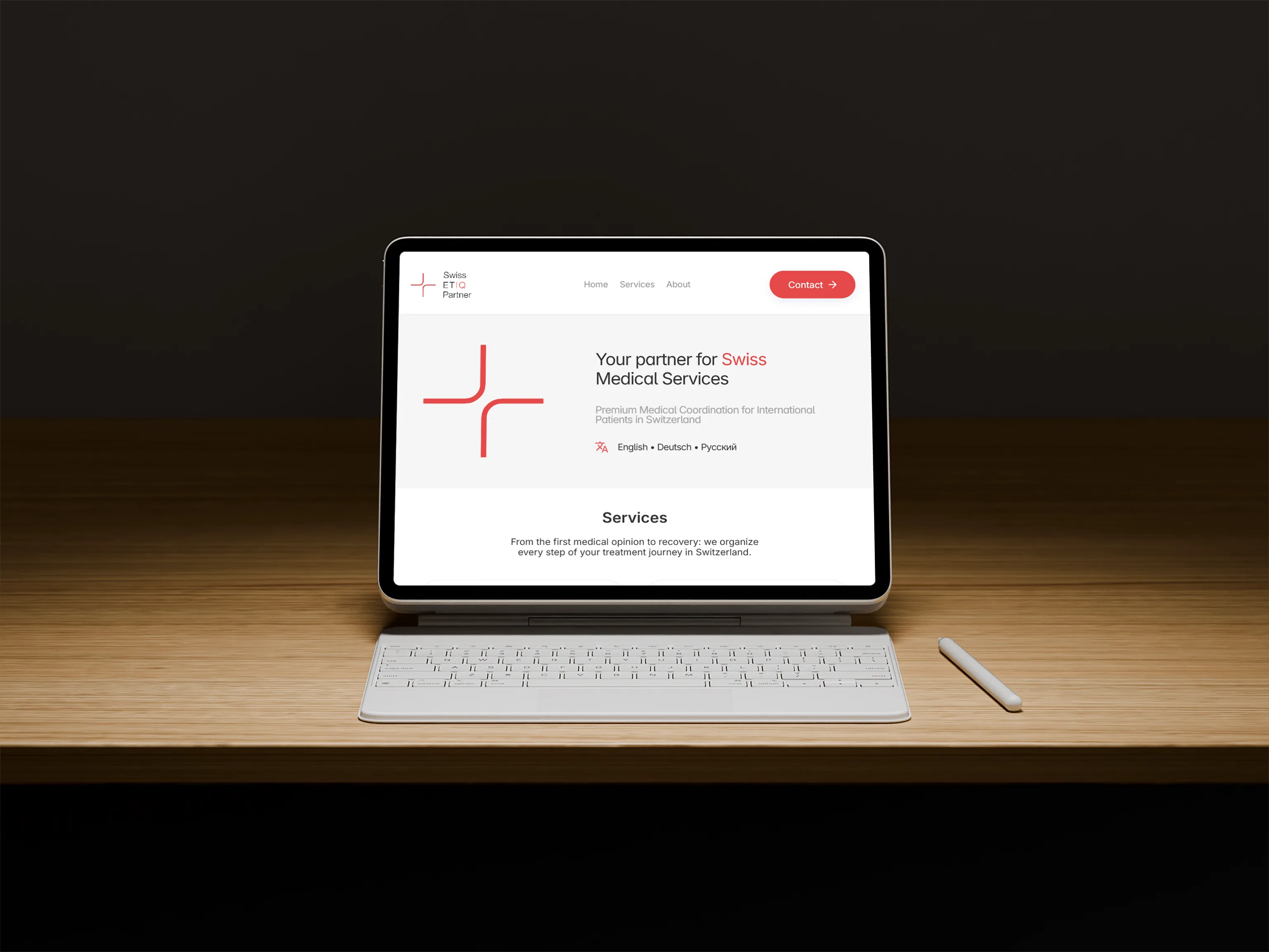
The business runs on a referral network cultivated over two decades. The website's role becomes confirmation, not acquisition. Someone has heard the name from a person they trust, and the site has to provide a clear overview of the services, confirm the recommendation, and establish trust within seconds.
Clarity as the highest standard.
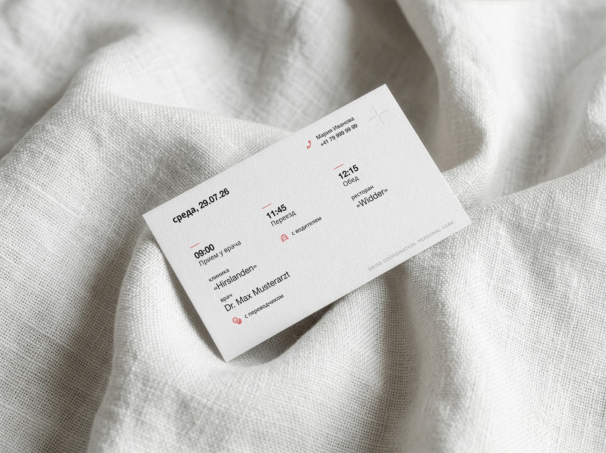
One typographic system accounts for Latin and Cyrillic, because the real materials are mixed by nature: an appointment card lists the day in Russian, while clinic, doctor, and restaurant names remain in the language the patient will encounter on-site.
High contrast, generous sizing, and unambiguous hierarchy take precedence over decoration, because for this reader, informational clarity is reassurance.
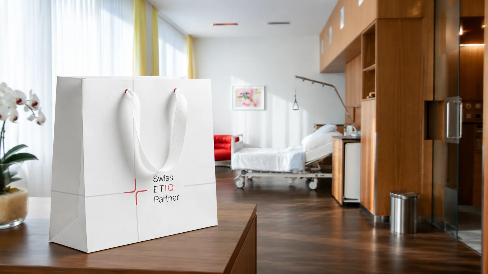
04 — Result
✦ Brand identity from zero
Logo, color palette, and typography, developed without any existing material and without legacy constraints.
◼ Website for desktop and mobile
Not acquisition but confirmation: a clear overview of the services, trust within seconds.
➤ Document templates
Invoices and offers follow the same standard of clarity as the website, from the first email to the final invoice.
◈ One system, two scripts
Latin and Cyrillic as equals in a single typographic system, the way the real materials demand.
Previous case study
← Olga DuminikaNext case study
A. Gubler Beauty →